From Numbers to Narratives: The UX of Storytelling with Data

As an engineer, I have spent time building models and working with data. Along the way, I noticed something surprising: the work that actually changed decisions wasn't always the most technically impressive - it was the work with the clearest charts. A well-designed visualization could get a room full of stakeholders aligned in seconds. A poorly designed one, no matter how solid the analysis behind it, would just get skipped over.
That made me curious. What exactly separates a chart that communicates from one that just sits there? I found the answer in two people's work: Don Norman, a cognitive scientist and designer who pioneered the field of user-centered design, and Edward Tufte, a statistician whose work defined how we think about presenting data visually. This post is about what I learned from combining their ideas - and how it can help anyone who works with data tell a better story.
Why Most Charts Fail
Here's how most charts get made: you have some data, you pick a chart type, you hit generate. Done. But this skips the question that matters most - who is going to look at this, and what should they walk away understanding?
Most charts don't fail because the data is wrong. They fail because nobody thought about the reader. Here are the patterns I see again and again:
- Too much information. Every single data point gets equal visual weight, so nothing stands out. The reader is left staring at a wall of bars or lines, trying to figure out what they're supposed to notice. A good chart does that work for them.
- Wrong chart type. Think of a pie chart sliced into 15 near-identical wedges. You can't tell which slice is bigger than which. A simple ranked bar chart would make the comparison instant. Or sometimes there's no need for a chart at all - if the point is "revenue grew 12%," just say that in big bold text. The format should carry the message, not get in its way.
- Missing context. Say you have a chart showing server uptime going from 98% to 99%. If the y-axis runs from 0% to 100%, you see it for what it is: a small, steady improvement. But crop that y-axis to show only 97% to 100%, and suddenly the same data looks like a dramatic spike. Same numbers, completely different impression. Charts need honest baselines, annotations that explain what matters, and comparisons that give the numbers meaning. Without context, data doesn't just fail to inform - it can actively mislead.
- Inaccessible design. Red and green color coding might seem intuitive, but roughly 8% of men are colorblind and literally can't distinguish them. Add tiny labels, no alt text for screen readers, and low contrast - and you've locked out a meaningful chunk of your audience without even realizing it.
The interesting thing is that the fix for all of these is the same: start with the person reading the chart, not the data you want to show. That shift in thinking is exactly what Don Norman's work is about.
What Don Norman Can Teach Us About Charts
If you haven't come across Don Norman's The Design of Everyday Things, it's one of those books that changes how you see the world. It's a foundational work on how people interact with designed objects - why some doors are confusing and some are obvious, why some tools feel natural and others fight you every step of the way.
The thing is, a chart is also a designed object. It's an interface between the data and the person trying to understand it. And Norman's principles apply to charts just as well as they apply to door handles. Here's how.

Affordances and Signifiers
Affordances provide strong clues to the operations of things. Plates are for pushing. Knobs are for turning.
An affordance is something that tells a user what they can do. In a chart, a clickable legend that filters data series is an affordance - it invites you to interact. A data point that reveals its exact value when you hover over it is another one.
But affordances only work if people can actually see them. That's where signifiers come in. Axis labels that clearly explain what each dimension represents. Color-coded legends that map directly to the data categories. A cursor that changes shape when you hover over something clickable. These are all signifiers - visual cues that say "hey, you can do something here." If users can't tell your chart is interactive, that interactivity might as well not exist.
Mapping and Feedback
When mapping uses spatial correspondence between the layout of the controls and the devices being controlled, it is easy to determine how to use them.
Good mapping means the connection between what you do and what happens is obvious. When you drag a time-range slider, the chart updates to show exactly that range. When you click a legend item, that series toggles on or off. There's no guesswork.
Feedback is the other half of this. When someone interacts with your chart, something visible should happen immediately - the selected data point highlights, a tooltip pops up with exact numbers, the chart smoothly transitions to the new view. Without feedback, users are left wondering: did my click actually do anything? That moment of uncertainty breaks trust.
Constraints and Conceptual Models
A conceptual model is an explanation, usually highly simplified, of how something works. It doesn't have to be complete or even accurate as long as it is useful.
Constraints are about preventing meaningless interactions. If your data is monthly, users shouldn't be able to zoom in to individual seconds - that just creates confusion. Good constraints guide people toward useful interactions without making them feel restricted.
Conceptual models are about matching expectations. People already carry assumptions about how charts work: time flows left to right, higher is better, green is positive, red is negative. When your chart aligns with these mental models, comprehension is almost instant. When it fights them - say, putting the most recent date on the left - people stumble, even if they can't articulate why.
Error Tolerance and Simplicity
Simplicity design axiom: The complexity of the information appliance is that of the task, not the tool. The technology is invisible.
People will make mistakes. They'll select incompatible filters, accidentally deselect all data series, or click on the wrong thing. A well-designed chart handles this gracefully - showing a helpful message instead of a blank screen, offering a clear "reset" button, making it easy to undo the last action.
And above all: simplicity. If someone needs instructions to read your chart, the chart has failed. The goal is for users to focus entirely on the insight, not on figuring out how the interface works. Norman puts it perfectly:
The real problem with the interface is that it is an interface. Interfaces get in the way. I don't want to focus my energies on an interface. I want to focus on the job.
Telling Stories, Not Just Showing Data
There's a fundamental difference between a chart that displays data and a chart that tells a story. The first one dumps information on the reader and says "here, you figure it out." The second one takes the reader by the hand and walks them to a conclusion.
The secret is structure. Every good data story has three parts:
- Context - Why should I care? What question is this answering?
- Presentation - What does the data show? What are the key patterns and turning points?
- Insight - So what? What should I take away from this, and what does it mean for my next decision?
Once you have that structure, everything else follows. Color should draw attention to the important trend, not decorate. Annotations should point to the moment in the data where something changed. And everything that doesn't directly serve the story - extra grid lines, secondary data, overly granular labels - should fade into the background or go away entirely.
Content precedes design. Design in the absence of content is not design, it's decoration.
Two Visualizations That Changed History
Theory is useful, but sometimes the best way to understand great chart design is to look at charts that actually mattered. Here are two that have stood the test of time - and both are worth studying closely.
Minard's Map of Napoleon's March (1869)
This is often called the greatest statistical graphic ever made, and once you see it, you'll understand why. Charles Joseph Minard packed six dimensions of data into a single image: the size of Napoleon's army, their geographic location, the direction they were traveling, the dates, and the temperature during the retreat from Moscow.
Look at the band as it moves from left to right - it starts wide (422,000 soldiers) and gets progressively thinner as the army marches into Russia. On the return journey (shown in black), it gets dramatically thinner. By the time the army reaches home, only about 10,000 remain. The temperature line at the bottom tells you why - the brutal Russian winter, dropping to -30 degrees, killed most of them.

No legend is needed. No instructions. You look at it and immediately feel the scale of the disaster. That's because every visual element carries meaning - the width is army size, the color separates advance from retreat, the geography is real. Nothing is decorative. Everything is data.
John Snow's Cholera Map (1854)
In 1854, cholera was tearing through London, and nobody knew why. The accepted theory was "bad air" - that the disease spread through foul smells. A physician named John Snow thought otherwise. He suspected contaminated water.
To test his theory, Snow did something remarkably simple: he mapped every cholera death as a small stacked bar at the victim's address, and he marked the location of every public water pump. When he stepped back and looked at the map, the answer was staring right at him. The deaths clustered tightly around one pump - the Broad Street pump. The pattern was so obvious that it helped overturn the dominant scientific theory of the time. The pump handle was removed, and the outbreak stopped.
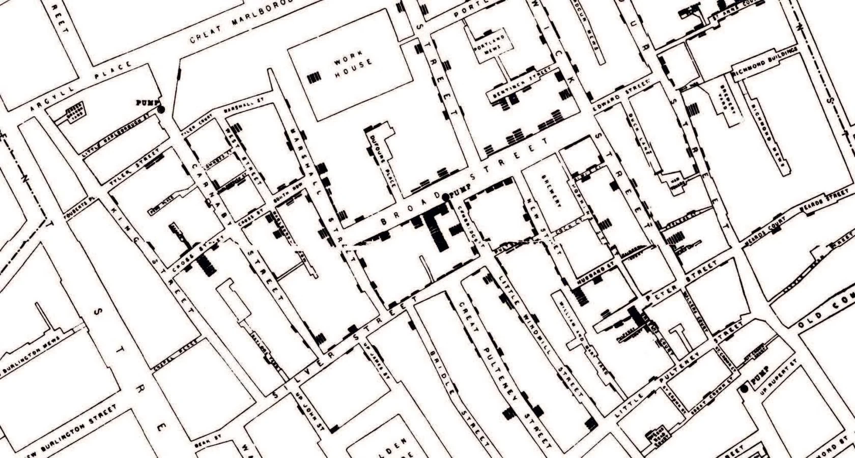
What makes this visualization so effective is that it answers a specific question: "where are people dying, and is there a pattern?" It doesn't just display data points - it reveals a relationship that was invisible before. The spatial layout does the arguing for you.
Tufte's Core Principle: Maximize Data, Minimize Ink
Edward Tufte's The Visual Display of Quantitative Information ties all of this together with one powerful idea: the data-ink ratio. The concept is simple - every mark on a chart should represent actual data. Anything that doesn't (decorative borders, 3D effects, heavy grid lines, redundant labels) is "non-data ink," and it dilutes your message.
Think about the last chart you made. How much of it was actually showing data, and how much was just... decoration? Tufte would say: if you can remove something from the chart and no information is lost, it shouldn't be there in the first place.
Graphical excellence is that which gives to the viewer the greatest number of ideas in the shortest time with the least ink in the smallest space.

Here's what I find interesting: Tufte and Norman are really saying the same thing, just from different angles. Norman says: make the interface disappear so users can focus on the task. Tufte says: make the decoration disappear so readers can focus on the data. Both are pointing at the same truth - the best design is the kind you don't notice, because it just gets out of the way and lets the content speak.
Key Takeaway
The next time you're about to create a chart, pause and ask yourself three questions before you touch any tools: Who is going to look at this? What should they understand within five seconds of seeing it? And what can I remove without losing that understanding?
If you answer those honestly, you'll end up with something that doesn't just display information - it communicates. And that's the real difference between a chart someone glances at and forgets, and one that actually changes how they think.