tsanomaly: A Generic Framework for Time-Series Anomaly Detection
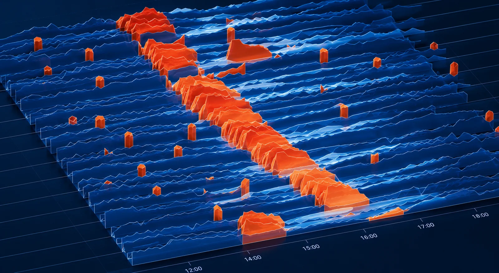
These are my notes on tsanomaly - a Python library I recently open-sourced for anomaly detection on time-series metrics. It is an attempt at a generalized solution with no thresholds to configure: it learns the normal behavior and seasonality of each individual metric on its own, and explains why a point was flagged as anomalous. The design is inspired by Anodot's original patents. Here is how it works.
The Curse of Low Dimensionality
I've spent a good amount of my career building analytics and data science solutions on machine data - sensor readings, industrial telemetry, operational metrics etc. This kind of data has one defining property: each observation is extremely low-dimensional. An image has thousands of correlated pixels. A document has a whole vocabulary. A metric has just a timestamp and a single number - even though the system that produced it is just as complex. That's what makes time series hard to model: most of the times the data doesn't have enough dimensions to capture what is really happening underneath.
With so few dimensions, forecasting and anomaly detection models have very little to work with. So in practice, teams fall back on simpler approaches - and each one breaks down at scale. Static thresholds generate too many false alarms once a metric has a daily cycle. Classical models need per-series tuning, which is not practical when you monitor thousands of metrics. And every metric behaves differently - a spiky network counter and a smooth temperature sensor should not be judged by the same rule. What you really need is a system that learns each metric on its own, without a human in the loop.
Years ago, while working in this problem space, I came across the patents of Anodot, an Israeli company that built a generic anomaly-detection product for this kind of data. I liked the way they framed the solution: learn a baseline for every metric automatically, score anomalies against that metric's own history instead of a global rule, detect seasonality automatically, and group concurrent anomalies across metrics into single incidents [1] [2]. That framing stuck with me. tsanomaly is my take on the same problem - inspired by those ideas, but implemented with more recent statistical techniques.
What tsanomaly Is
tsanomaly watches any number over time, learns what normal looks like for that specific series, and reports genuinely unusual events with a calibrated 0-100 score and a full explanation:
pip install tsanomalyimport tsanomaly as tsa
det = tsa.Detector.auto()
det.fit(history_df) # learn normal, per metric
result = det.detect(new_df) # scored, explained anomalies
for anomaly in result.alerts(min_score=70):
print(anomaly.explain().headline)Here is real output on real data - NYC taxi ridership from the Numenta Anomaly Benchmark [8]. The detector learned the daily and weekly seasonality on four months of history, then found the documented disruptions on its own:
`nyc.taxi.passengers` dropped to 7076 (expected 18060 to 25606)
    for 33.0 h starting 2014-11-27 05:30 UTC - score 100.   # Thanksgiving
`nyc.taxi.passengers` spiked to 23848 (expected 15488 to 19792)
    for 6.0 h starting 2015-01-18 09:30 UTC - score 100.    # MLK weekend
`nyc.taxi.passengers` dropped to 570 (expected 15629 to 22110)
    for 39.0 h starting 2015-01-26 11:30 UTC - score 100.   # blizzard travel ban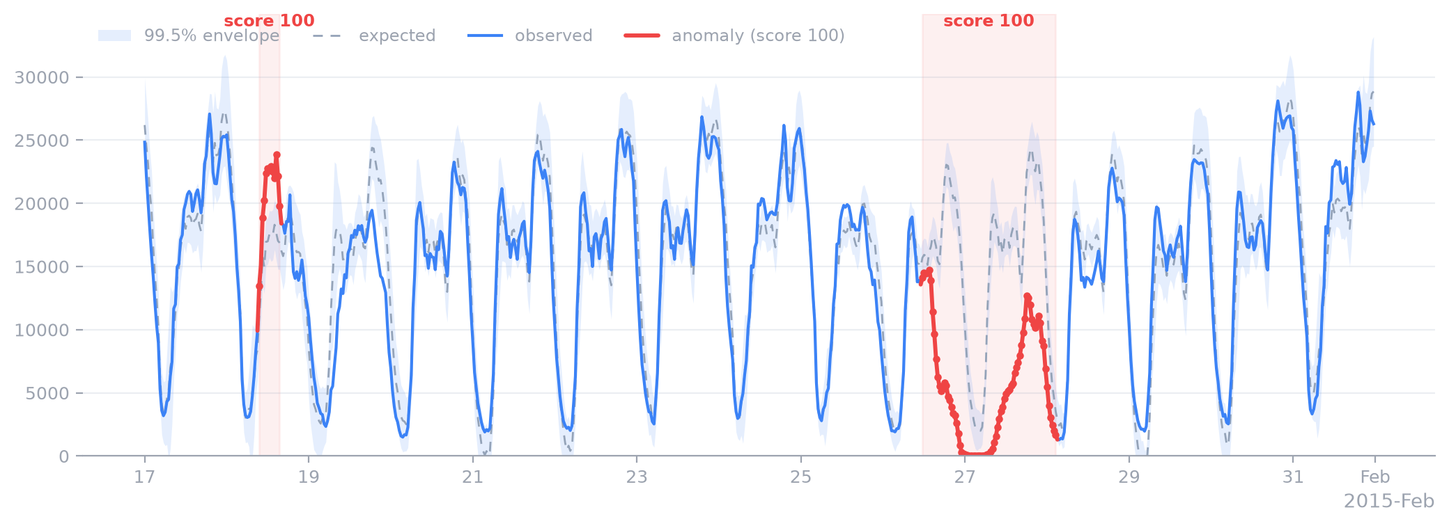
That last red block is the January 2015 North American blizzard, when New York banned road travel and city-wide taxi ridership collapsed to almost nothing for 39 hours. Nobody told the model about blizzards.
How It Works
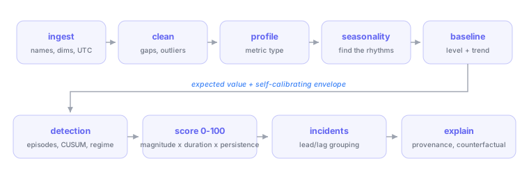
Every metric goes through the same pipeline: learn its normal behavior, predict a range of expected values, detect deviations, score their severity, and explain them. A few stages do most of the work:
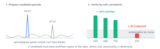
- Seasonality is proposed, then verified. Finding seasonality happens in two steps. First, a Lomb-Scargle periodogram [11] scans the metric's frequency spectrum and proposes candidate periods - for example, “this metric might repeat every 24 hours”. It handles missing data well, but noise can produce false peaks, so no candidate is trusted on its own. Second, each candidate is verified: if the period is real, the metric should correlate strongly with itself one, two, and three periods back. That correlation is compared against the same measurement on shuffled copies of the data, where any real seasonality has been destroyed - a candidate that does not clearly beat the shuffled copies is rejected. Verified periods are removed one at a time, shortest first, and the search repeats on what remains. This way a metric with both daily and weekly seasonality gets both, and a multiple of the daily cycle is never mistaken for a real weekly pattern.
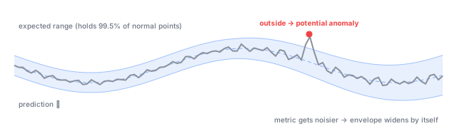
- The envelope is measured, not assumed. For every metric, the model predicts what the next value should be and draws an envelope around that prediction - the range where normal values are expected to land. Anything outside it is a potential anomaly, so getting the width right is everything. Instead of assuming a distribution (“errors are Gaussian, so use three sigma”), the width is calibrated with adaptive conformal inference [6]: it is set from the prediction errors actually observed on that metric, and a feedback loop adjusts it so the envelope keeps containing 99.5% of normal points. If a metric gets noisier, its envelope widens automatically. The one exception: points already flagged as anomalous are excluded from this calibration - otherwise a large anomaly would stretch the envelope and hide the anomalies that follow it.
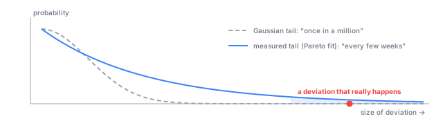
- Rarity comes from extreme value theory. Knowing a point is outside the envelope is not enough - the score should reflect how rare that deviation actually is. The naive approach is to assume errors are Gaussian and read the probability off that curve, but real metrics have heavy tails: deviations a Gaussian calls once-in-a-million can show up every week. So the tail is modeled directly with a generalized Pareto distribution [7], fitted to the large deviations actually observed on that metric. How far a point landed outside the envelope is then converted into an honest probability - and that probability is what the 0-100 score is built from.
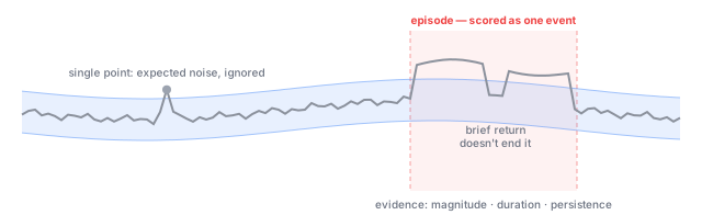
- Detection works on episodes, not points. A 99.5% envelope, by definition, lets one normal point in every 200 land outside it - alerting on every single excursion would be constant noise. So consecutive out-of-envelope points are grouped into one episode, with hysteresis: a brief dip back inside the envelope does not end the episode. Each episode is then scored on three kinds of evidence: how far outside the envelope it went (magnitude), how long it lasted (duration), and how consistently it stayed outside (persistence). These three are obviously not independent - a severe episode tends to score high on all of them - so they are combined with a harmonic-mean p-value [9], a method that stays statistically valid even when the evidence is correlated.
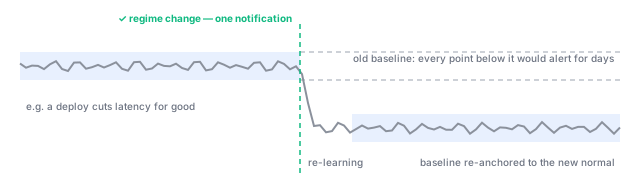
- A new normal is not an anomaly. Sometimes a metric shifts permanently - a deploy cuts latency in half, a config change doubles traffic. To a detector that only compares against the old baseline, every point after such a shift looks anomalous, and it will keep alerting for days until the baseline catches up. Bayesian online changepoint detection [5] is used to tell the two apart: a deviation that settles into a new stable level is recognized as a “regime change” rather than an anomaly. The baseline is re-anchored to the new level, and you get one notification instead of days of alerts.
- Concurrent anomalies become one incident. A single real-world failure rarely touches just one metric - a bad deploy can push latency, error rate, and queue depth sideways at the same time, and paging someone twenty times for one outage helps no one. So when episodes on different metrics overlap in time far more than chance would predict, they are merged into a single incident. Inside the incident, metrics are ordered by which one moved first - a useful root-cause hint, since the origin of a failure usually moves before its downstream effects. One subtlety: twenty metrics that always move together are not twenty independent pieces of evidence, so the incident's significance is computed from the effective number of independent signals [10] and correlated metrics are not double-counted.
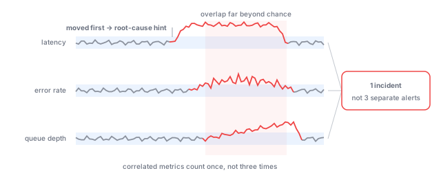
Every anomaly comes with a full explanation: the expected range, the score breakdown, the model that produced it, and a counterfactual - “no alert would have fired for values between X and Y at that time.”
Prior Works
The overall architecture - per-metric baselines learned automatically, scoring against a metric's own history, automatic seasonality detection, incident grouping - is the shape Anodot's patents describe [1] [2] [3]. The methods inside each stage are deliberately different: I used statistical techniques published after those patents were filed, such as adaptive conformal inference for envelope widths, extreme value theory for tail probabilities, Bayesian online changepoint detection for regime changes, and the harmonic-mean p-value for combining evidence. None of this is a claim that tsanomaly is better than a product refined in production for a decade. It is a design lineage, acknowledged openly in the architecture doc: I kept the architecture the patents describe, and swapped the mechanisms for ones I could build in the open, on published research.
Validating on Machine Data
Given where this started for me, the test I cared most about was industrial sensor data. The Bosch CNC Machining dataset [12] contains tri-axial vibration from a production milling machine, recorded over two and a half years, with each machining cycle labeled good or bad by process experts. I reduced each cycle to per-second vibration energy, fit on the 2019 cycles, and detected from 2020 on:
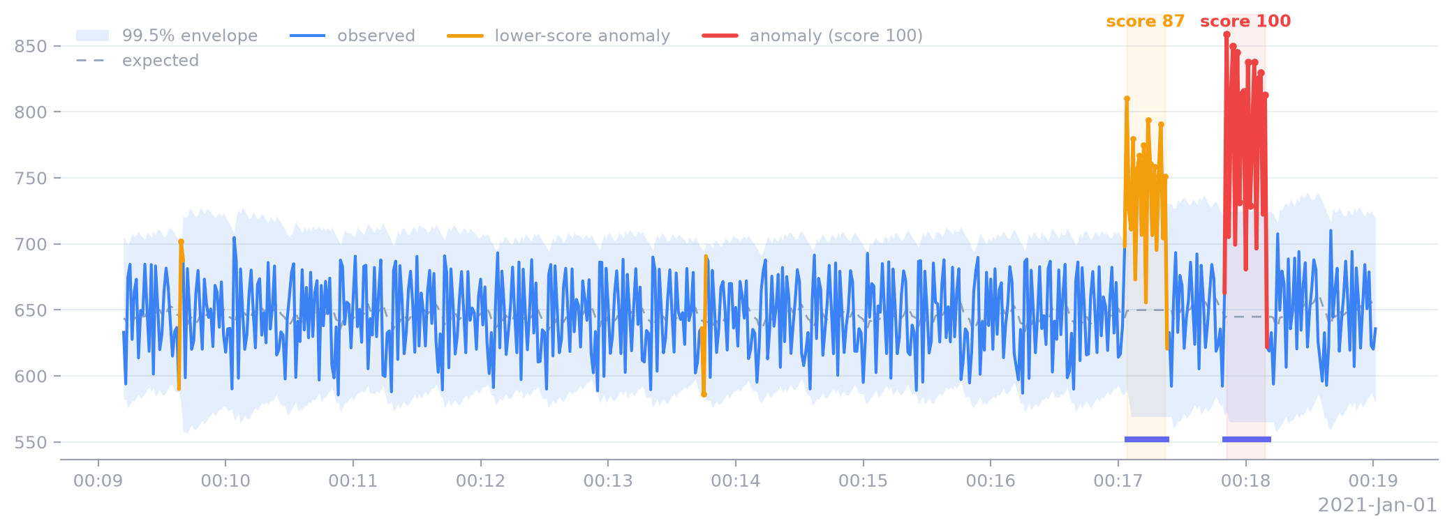
The two cycles that alert - scores 87 and 100 - are exactly the two cycles Bosch labeled bad (the indigo bars). The 22 good cycles produce zero false alerts. And the training window itself contained two mildly anomalous cycles that the robust learners simply absorbed without being told. That, in one chart, is the property I wanted: judgment calibrated to each machine's own normal, with the receipts to explain every call.
Try It
The library is on PyPI (pip install tsanomaly, Python 3.9+) and the source is on GitHub, with a usage guide, the full architecture doc, and runnable examples.
Issues and pull requests are welcome.
References
- US 10,061,632 - System and method for transforming observed metrics into detected and scored anomalies. Google Patents
- US 10,061,677 - Fast automated detection of seasonal patterns in time series data. Google Patents
- US 2016/0210556 A1 - Heuristic inference of topological representation of metric relationships. Google Patents
- US 12,101,343 - Event-based machine learning for a time-series metric. Google Patents
- Adams RP, MacKay DJC (2007). “Bayesian Online Changepoint Detection.” arXiv:0710.3742
- Gibbs I, Candès E (2021). “Adaptive Conformal Inference Under Distribution Shift.” NeurIPS 2021. arXiv:2106.00170
- Siffer A, Fouque P-A, Termier A, Largouët C (2017). “Anomaly Detection in Streams with Extreme Value Theory.” KDD 2017. DOI
- Lavin A, Ahmad S (2015). “Evaluating Real-Time Anomaly Detection Algorithms - the Numenta Anomaly Benchmark.” NAB corpus
- Wilson DJ (2019). “The harmonic mean p-value for combining dependent tests.” PNAS 116(4). DOI
- Galwey NW (2009). “A new measure of the effective number of tests.” Genetic Epidemiology 33(7). DOI
- VanderPlas JT (2018). “Understanding the Lomb-Scargle Periodogram.” ApJS 236. DOI
- Tnani M-A, Feil M, Diepold K (2022). “Smart Data Collection System for Brownfield CNC Milling Machines.” Procedia CIRP 107. Bosch CNC Machining dataset